Data Tables
Overview
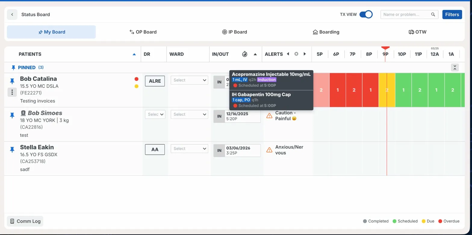
A data table displays structured information in rows and columns. Tables appear throughout the Instinct EMR — analytics reports, admin product lists, patient registration, diagnostics, accounts, and the status board. Most tables show text, labels, and a handful of action controls. The status board is the most complex instance, with rows that contain a dense mix of interactive cells including patient identity, doctor and ward controls, timestamps, alert indicators, and a color-coded treatment timeline.
Sandbox
Anatomy
- Table container — The outer surface that holds the header row and body, set on
--bg-elevation-1. - Header row — A sticky row at the top containing column labels and optional sort controls.
- Header cell (
table/cell-header) — Individual column label; variants include Pinned, Patients, Dr, Ward, In/Out, Alerts, Cage Card Info, Time, and empty. - Sort indicator (optional) — Directional icon indicating ascending or descending sort order.
- Body row — A single record; may include subrows for expanded detail.
- Data cell (
table/cell-row) — The individual cell within a row; the cell type is swapped based on column context. - Row actions (optional) — Overflow menu and pin icon at the leading edge of status board rows.
- Bulk action bar (optional) — A contextual bar that appears above the table when rows are selected.
- Footer (optional) — A summary or pagination row at the bottom of the table.
- Empty state — A message shown when the table has no rows to display.
Cell Types
The table/cell-row component is swapped per column to match the data type being displayed. Available cell types:
Text and label cells
- Text — A plain text value displayed in the cell
- Patient — Patient name in
body-title-lg(16px/600) with signalment (species, age, weight, breed), patient ID, and visit type stacked below - Observation — A clinical text note rendered in
body-md(14px/400) - Icon & Text — A small icon paired with a text label
- Account — Account name with associated phone number(s) listed below; each line pairs an icon with its value
- Visit — Check-in and check-out timestamps with attending doctor; each row pairs an icon with its value
- Status — A status chip with icon and short label, displayed on a colored background (e.g., blue for "To Review")
- Chip — A standalone filled or outlined chip/badge within the cell
Interactive cells
- Doctor — An editable doctor tag rendered as a tertiary button; selecting it opens a search popover to assign or reassign
- Ward — Displays the assigned ward in uppercase utility style; tappable to change
- In/Out — A compact pill showing IN or OUT state alongside a formatted date and time
- Toggle — An inline toggle for boolean settings with an adjacent label
- Input & toggle — An inline text field paired with a toggle switch
- Input — An inline text field embedded directly in the cell
- Text & check — A checkbox paired with a text label
- Button — An action button embedded within the row (e.g., "+ Add")
- Actions — A group of secondary action buttons for row-level operations (e.g., Record)
- Checkbox — A leading selection checkbox for bulk edit rows
- Overflow — A 3-dot icon button that opens the row overflow menu
- Overflow & Pin — The combined overflow menu trigger and pin icon used on status board rows
Treatment timeline cells
- time-empty — An unoccupied time slot
- time-scheduled — A scheduled treatment (green)
- time-due — A treatment due now (yellow/orange)
- time-overdue — A past-due treatment (red)
- time-completed — A completed treatment (grey)
Structure cells
- Pinned — The pin state indicator on a row
- Vitals Bar — A compact vitals summary strip with a category label and a filled bar below it
Variants
Standard table
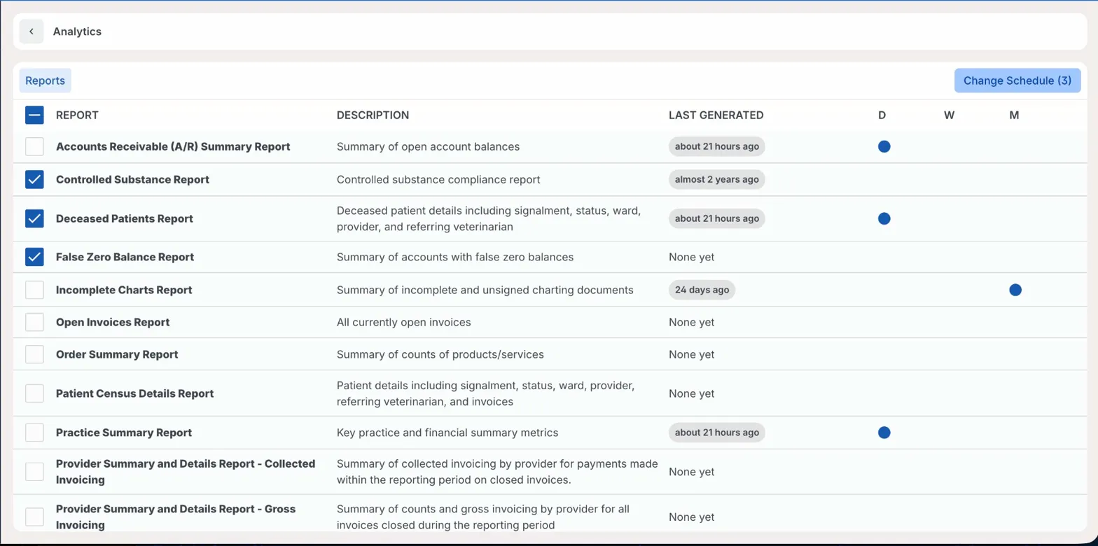
The default form used across analytics, diagnostics, admin (products, product groups, reminder labels), accounts, patient registration, and the business office. Rows contain text cells, status chips, or simple labels. Cells are not inline-editable; rows navigate to a detail view or trigger a modal on click.
[Screenshot: Analytics — Reports list with schedule indicator dots in D/W/M columns]
Standard table with bulk actions
An extension of the standard table that adds a leading checkbox cell (table/cell-row: Checkbox) to each row. Checking one or more rows reveals the bulk action bar above the table with context-appropriate actions. The header checkbox selects or deselects all visible rows. Used in analytics report scheduling, multi-location admin, and other bulk-edit flows.
[Screenshot: Analytics — Three rows selected, "Change Schedule (3)" button active]
Status board table
The most complex table instance in the product. Each row is a table/board-row and represents a live patient on the status board. The row contains a fixed set of specialized cells assembled from the table/cell-row component: Overflow & Pin, Patient, Doctor, Ward, In/Out, Alerts, and — when TX View is enabled — a series of treatment timeline cells spanning hourly time slots.
The full anatomy of the status board row is covered under Usage below.
Usage
Use the standard table for read-only or lightly interactive lists where row actions lead to a detail view or modal. This covers analytics, diagnostics, admin pages, and all business office and account tables.
Use bulk actions when the table needs to support selecting and acting on multiple rows at once. Analytics report scheduling and multi-location admin both use this pattern. Don't show the bulk action bar until at least one row is selected.
Use the status board table only for the status board. The table/board-row component is purpose-built for patient monitoring and shouldn't be recomposed for other contexts.
Status board row interactions:
- Pin — Tapping the pin icon adds the patient to the Pinned accordion at the top of the board and persists across sessions.
- Overflow menu — Three-dot menu at the row's leading edge. Provides actions: set doctor, set ward, view in/out time, add or view alerts, and open the full patient chart.
- Doctor cell — Displays the assigned doctor as a tag. Selecting it opens a search popover to assign or change.
- Ward cell — A dropdown select for assigning the patient's ward.
- In/Out cell — Displays the patient's check-in timestamp; tapping opens the in/out detail.
- Alerts cell — Shows alert icons (e.g., Anxious, Caution) with short labels. Tapping opens alert detail or creation.
- Treatment timeline — A row of hourly cells, each colored by treatment status (Completed, Scheduled, Due, Overdue). Hovering a cell reveals a tooltip listing each treatment's name, dose, route, frequency, and scheduled time.
When not to use a data table: Don't use a table to display a small set of key-value pairs for a single record. Use a description list, summary card, or form layout instead.
Best Practices
| Do | Don't |
|---|---|
Use utility-sm for all column header labels to maintain consistent hierarchy | Don't vary font weight across headers in the same table |
| Keep column labels short — one to three words. Use a tooltip if the label needs more context | Don't use full sentences or questions as column labels |
| Show a meaningful empty state when the table has no rows | Don't leave an empty table with no explanation |
| Show the bulk action bar only after at least one row is selected | Don't display bulk action controls when nothing is selected |
| Use color-coded timeline cells alongside a visible status legend | Don't rely on cell color alone to communicate treatment status |
| Limit inline interactive cells to the status board and purpose-built live-data tables | Don't introduce inline editing into standard list tables where a detail view is available |
Accessibility
- Use semantic
<table>,<thead>,<tbody>,<tr>,<th>, and<td>elements, or equivalent ARIA roles (role="grid",role="row",role="columnheader",role="gridcell") for non-native implementations. - Sortable columns must carry
aria-sort="ascending"oraria-sort="descending"when active, andaria-sort="none"when unsorted. - Row checkboxes must have an
aria-labelidentifying the specific row — for example,aria-label="Select Bindi Brauer". Never use a generic "Select" label across all checkboxes. - The bulk action bar must use
aria-live="polite"on its container so screen readers announce the selection count and available actions when it appears. - Treatment timeline cells must not convey status through color alone. Each cell must expose its status (Overdue, Due, Scheduled, Completed) via an
aria-labelor accessible tooltip text. - Keyboard navigation follows standard grid patterns: Tab to enter the table, Arrow keys to navigate between cells, Enter or Space to activate interactive cells, Escape to close open popovers or tooltips.
- Overflow menus and inline dropdowns must trap focus when open and return focus to the triggering element on close.