Accordion
Overview
A collapsible section lets users show or hide the body of a content section while keeping the header visible. The header always stays in place, expanded or collapsed, so nothing on the page shifts when a user toggles the section. Use it on pages where multiple sections of similar weight can make the layout feel long or cluttered.
Sandbox
Anatomy
- Header — Always visible. The stable anchor for the section regardless of state.
- Body — The content area that shows or hides on toggle.
- Collapse icon — The
collapse_verticalicon, placed in the header, triggers expand and collapse. It is the only interactive element for toggling the section.
Usage
Collapsible sections appear on pages where content is dense and sections have similar priority. They let users decide which sections to focus on without removing anything permanently.
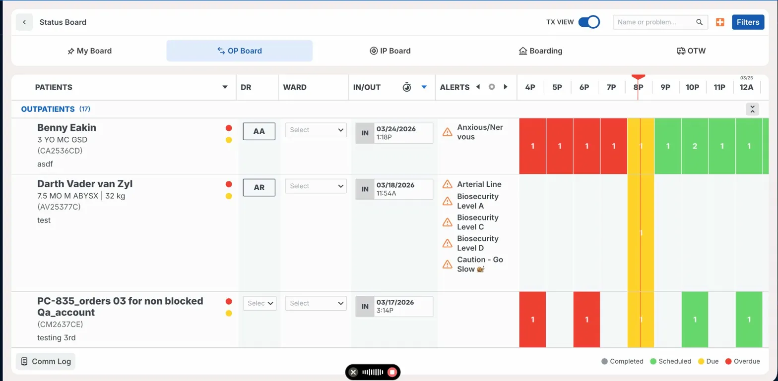
- On the Status Board, patient groups (Outpatients, Pinned, Out-paged) can each be collapsed independently. The group header stays fixed so users can expand any group without losing their place.
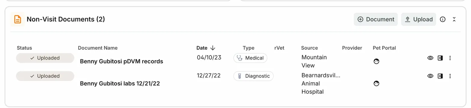
- On the Snapshot page, each widget panel (e.g., Non-Visit Documents, Problems, Diagnostics) can be collapsed. Users can hide reviewed sections to reduce scrolling while working through a patient chart.
When not to use: Don't add collapse to a section that could contain safety-critical information, active warnings, or system health alerts. That content should never be hidden from users.
Status Board — patient group sections
Snapshot page — widget panels
Best Practices
| Do | Don't |
|---|---|
Trigger collapse and expand only from the collapse_vertical icon | Don't make the entire header row a collapse trigger |
| Keep the header label visible and readable in the collapsed state | Don't collapse sections that may contain alerts, warnings, or safety-critical status |
| Use collapsible sections when two or more equal-weight sections appear on the same page | Don't collapse a section by default; let users control their own layout |
| Preserve collapse state within a session so users don't lose their layout on navigation | Don't use collapse to hide a single item or an infrequently used section |
Accessibility
- The
collapse_verticalicon button must be a focusable element withrole="button". - Use
aria-expanded="true"oraria-expanded="false"on the icon button to communicate state to screen readers. - The body panel should use
aria-hidden="true"when collapsed to remove it from the accessibility tree. - Keyboard:
Tabmoves focus to the icon button.EnterorSpacetoggles the section. - The icon is functional, not decorative. Give it an accessible label:
aria-label="Collapse section"oraria-label="Expand section"based on current state.