EMR UI Refresh – Accessibility Audit Report
We Hear You
We've heard from several of you that the new UI feels harder to read and navigate. That feedback matters, and we want to address it directly — not deflect it with metrics.
Veterinary workflows are demanding. Staff are moving fast, often in low-light or high-glare environments, relying on muscle memory built over months or years. When an interface changes — even when it changes for good reasons — that rhythm gets disrupted. The disorientation is real, and so is the frustration.
The data in this report tells us that the refresh improved technical accessibility across every audited page: contrast failures dropped significantly, structural issues were resolved, and no score declined. We're sharing that baseline honestly, not as proof that everything is fine, but as a starting point. Technical compliance and felt usability are not the same thing, and we know there's a gap to close between where the scores land and how the product feels in a real clinical shift.
That gap is now our active focus. We are reviewing padding, information density, and specific color decisions based on what we're hearing from the field — and we want your continued input.
Report Summary
| Metric | Change |
|---|---|
| Average accessibility score | ▲ +6 points (82% → 88%) |
| Total violations | ↓ −39% (5,301 → 3,228) |
| Checks now passing | ↑ +2,147 (24,561 → 26,708) |
| Pages with contrast failures ¹ | ↓ 13 of 13 → 3 of 13 |
| Landmark structure issues | ✓ Fully resolved |
| Diagnostics page score | ▲ +11 points (84% → 95%) |
What is Accessibility
Accessibility means software works for everyone. Regardless of whether someone uses a screen reader, navigates by keyboard, or is simply working under glare at the end of a long shift. WCAG 2.2 AA is the internationally recognized standard for this, and the benchmark for ADA and Section 508 compliance. The core areas it covers:
- Color contrast (4.5:1 for body text, 3:1 for large text and icons)
- Keyboard navigation (every interactive element reachable without a mouse)
- Screen reader structure (landmark regions, heading hierarchy, content sequencing)
- Focus visibility (always a visible indicator when navigating by keyboard)
- Forms and error handling (labeled inputs, errors communicated in text — not color alone)
Accessibility is not a one-time audit or a compliance checkbox. It affects everyone — permanently, temporarily, or situationally.
Technical vs. Perceptual Accessibility
WCAG measures objective thresholds. Perceptual accessibility is about how the interface feels under real conditions: an older monitor under fluorescent lights, a high-stress shift, or muscle memory disrupted by a spacing change. Technical compliance ensures the product can be used. Perceptual accessibility ensures it can be used well.
Our Goal
We addressed accumulated design inconsistencies and built accessibility into the component foundations. Our aim was to bring visual consistency and hierarchy, without disrupting functionality or existing workflows.
We're committed to both technical accessibility through regular audits and design governance, and perceptual accessibility by staying responsive to how the product actually feels in your workflows. The data in this report reflects real, measurable progress — and closing the gap between what the scores show and how the product feels in a real clinical shift is our active focus.
Before & After
The tables below document where things stood before the refresh and where they stand now. The improvements are real — and they represent the floor we're building on, not the ceiling we're satisfied with.
Page Scores
| Page | Before | After | Change |
|---|---|---|---|
| Patient: TX Sheet | 72% | 86% | ▲ +14% |
| Patient: Vitals | 76% | 86% | ▲ +10% |
| Diagnostics | 84% | 95% | ▲ +11% |
| Patient: AX Mode | 86% | 92% | ▲ +6% |
| Patient: Chart | 87% | 93% | ▲ +6% |
| Patient: Estimates | 81% | 86% | ▲ +5% |
| Business Office: Events | 85% | 89% | ▲ +4% |
| Patient: Invoice | 84% | 88% | ▲ +4% |
| Status Board: Boarding | 84% | 88% | ▲ +4% |
| Status Board: My Board | 84% | 86% | ▲ +2% |
| Analytics | 84% | 85% | ▲ +1% |
| Status Board: IP / OP Board | 83% | 84% | ▲ +1% |
¹ Scans cover the core clinical workflow pages as a representative sample. Because the same components and color tokens are shared across the entire product, improvements made at the component level apply broadly — not just to the pages explicitly scanned.
Building Blocks: Components & Design Language
Components are the building blocks of the interface — buttons, form fields, status badges — and they're shared across every page in the product. When a component meets an accessibility standard, that standard applies everywhere it appears. This is why working at the component level matters: a single change to a color token or interaction state propagates across the product automatically, raising the baseline continuously rather than requiring page-by-page fixes.
Components & Styles Accessibility Checklist
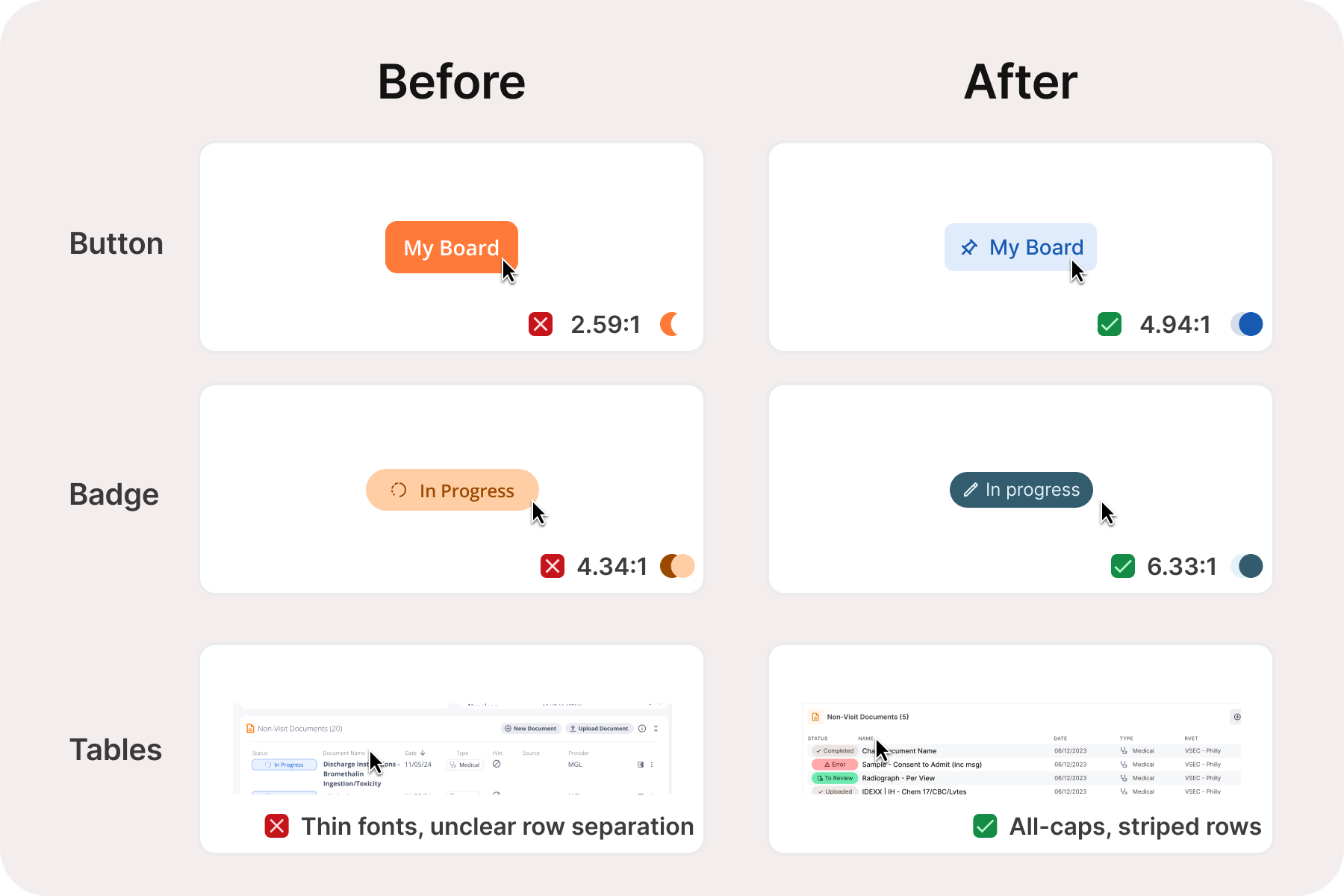
The columns below reflect what was validated through our scan: color contrast against WCAG 1.4.3 minimums, and whether each component's states (hover, active, focus, error, disabled) are visually distinct without relying on color alone.
| Component | Color Contrast | Visual States |
|---|---|---|
| Buttons | ||
| Button — primary, secondary, tertiary, flat, inverse (S/M/L) | ✓ | ✓ |
| Icon-only button | ✓ | ✓ |
| Icon + label stacked button | ✓ | ✓ |
| Button group | ✓ | ✓ |
| Toggle button group | ✓ | ✓ |
| Form Inputs | ||
| Input field (S/M/L — enabled, hovered, focused, disabled, error, placeholder) | ✓ | ✓ |
| Textarea | ✓ | ✓ |
| Select / dropdown | ✓ | ✓ |
| Number stepper | ✓ | ✓ |
| Verification / PIN input | ✓ | ✓ |
| Input Controls | ||
| Checkbox (S/M/L — enabled, hovered, focused, disabled, selected/deselected) | ✓ | ✓ |
| Radio button (S/M/L — same states) | ✓ | ✓ |
| Toggle / switch (S/M/L — same states) | ✓ | ✓ |
| Radio card | ✓ | ✓ |
| Data & Display | ||
| Avatar | ✓ | ✓ |
| Tag / chip / badge | ✓ | ✓ |
| Data table | ✓ | ✓ |
| Modal | ✓ | ✓ |
| Navigation | ||
| Top navigation | ✓ | ✓ |
| Breadcrumb / pagination | ✓ | ✓ |
| Typography | ||
| Body, labels, headings, helper text — color tokens | ✓ | N/A |
| Color System | ||
| Anesthesia & emergency status colors | ✓ Intentionally preserved — see note | N/A |
🚦 A note on emergency and status colors
The color system for patient status in the anesthesia sheet and status boards was deliberately left unchanged. These colors carry established clinical meaning for care teams — altering them would create retraining burden and potential for error in time-sensitive situations. They already meet contrast requirements and were not a source of accessibility failures.
Testing Methodology
This audit was conducted by Instinct's Product & Design team in March 2026. We used Stark — an accessibility testing tool — throughout the design process inside Figma (our design software), and ran the same scans against the live product to compare both states of the UI. Additional review was done using standard web developer tools to inspect the underlying page structure. Both the before and after scans were run on the same day under the same conditions to ensure a fair, apples-to-apples comparison.
Getting This Right for Your Workflows
The scores moved in the right direction. But we know that numbers don't capture what it feels like to squint at a status board under fluorescent lights at the end of a long shift, or to lose your place in a dense treatment sheet because spacing shifted. We are committed to getting this right, not just on paper, but in practice.
If something feels visually off, we want to know. You can report specific friction points directly to your customer success contact. The more specific the better: the page, the element, and the condition (lighting, monitor, time of day) all help us reproduce and prioritize what you're experiencing. Accessibility is ongoing, and quarterly audits, pre-release gates, and design governance keep the baseline from slipping. We're grateful for the feedback, and we're listening.