Typography
Typography in Axon is organized into three groups: Header, Body, and Utility. Each group has a distinct role in the visual hierarchy, and all three share the same size scale: extra small, small, medium, and large.
Type Groups
Header
Header styles are reserved for moments that need to command attention or establish a strong top-level hierarchy without competing with surrounding content.
| Style | Size | Weight |
|---|---|---|
header-xs | 20px | 700 |
header-sm | 24px | 700 |
header-md | 32px | 700 |
header-lg | 40px | 700 |
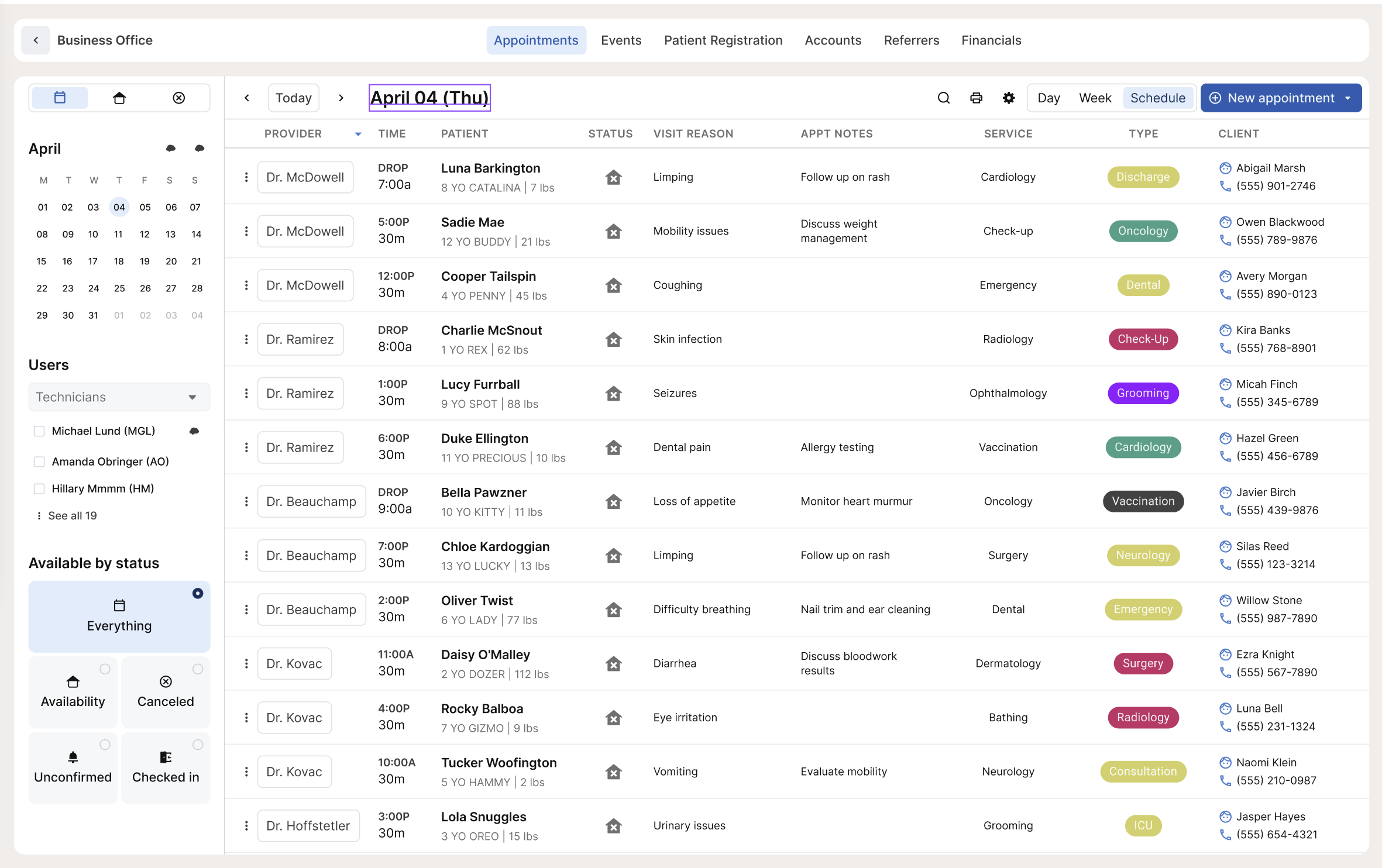
Use header styles for page-level headings, empty states, and zero states where there's significant whitespace and the text needs to anchor the view. On the Appointments calendar, the selected date in the top left uses a header style. The empty state on the same screen pairs a header style for the primary message with body-xs for the supporting description below it.

Body
Body styles cover most of the text in the app. They share the same size scale but differ by weight, which maps to three sub-groups. The right sub-group to reach for usually follows one of three rules:
- If it's clickable, use an interactive style.
- If it's body text, use a default body style.
- If it's a title or primary identifier for a collection of data, use a title style. Title styles are used sparingly.
Size within each group is a judgment call based on context. Match the density and hierarchy of the surrounding layout, and err toward legibility over compression.
Default Body
Regular weight (400). The workhorse of the app. Use for values, descriptions, timestamps, dates, and any text that isn't interactive or needs to stand out as a primary label.
| Style | Size | Weight |
|---|---|---|
body-xs | 10px | 400 |
body-sm | 12px | 400 |
body-md | 14px | 400 |
body-lg | 16px | 400 |
body-sm appears throughout the app in table cells, appointment details, and timestamps. body-xs works for supporting text in empty states or fine-print copy. body-md and body-lg suit larger or more readable sections of copy where density isn't a concern.
Interactive
Medium weight (500). Use whenever text is clickable or needs to read as actionable.
| Style | Size | Weight |
|---|---|---|
body-interactive-xs | 10px | 500 |
body-interactive-sm | 12px | 500 |
body-interactive-md | 14px | 500 |
body-interactive-lg | 16px | 500 |
The size you choose should match the surrounding body text so interactive elements feel at home in the layout, not oversized.
Title
Bold weight (700). Use when a piece of text needs to serve as the primary identifier for a card or row within a collection of data. This is the rarest of the three body sub-groups.
| Style | Size | Weight |
|---|---|---|
body-title-xs | 10px | 700 |
body-title-sm | 12px | 700 |
body-title-md | 14px | 700 |
body-title-lg | 16px | 700 |
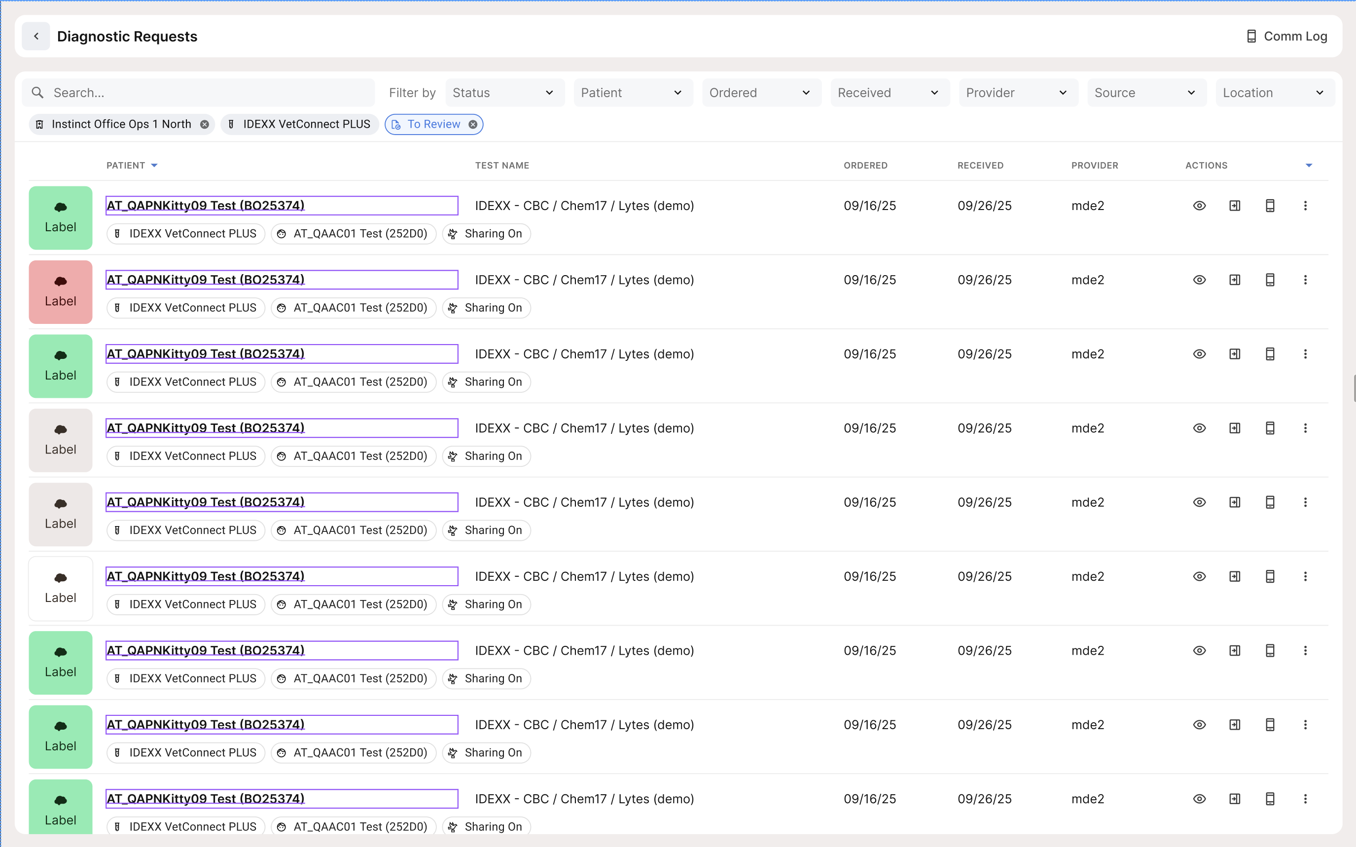
In the Diagnostic Requests view, the patient name uses a title style to anchor each row as a distinct record. Use title styles when weight alone is what distinguishes the label from its surrounding data.
Utility
Utility styles are bold (700) and rendered in all caps via text-transform: uppercase. They're for labels that organize or categorize content, not for reading extended text.
| Style | Size | Weight |
|---|---|---|
utility-xs | 10px | 700 |
utility-sm | 12px | 700 |
utility-md | 14px | 700 |
utility-lg | 16px | 700 |
utility-md is the standard for column headers in most tables. On the Appointments calendar, columns like PROVIDER, TIME, PATIENT, STATUS, and VISIT REASON use utility styles.
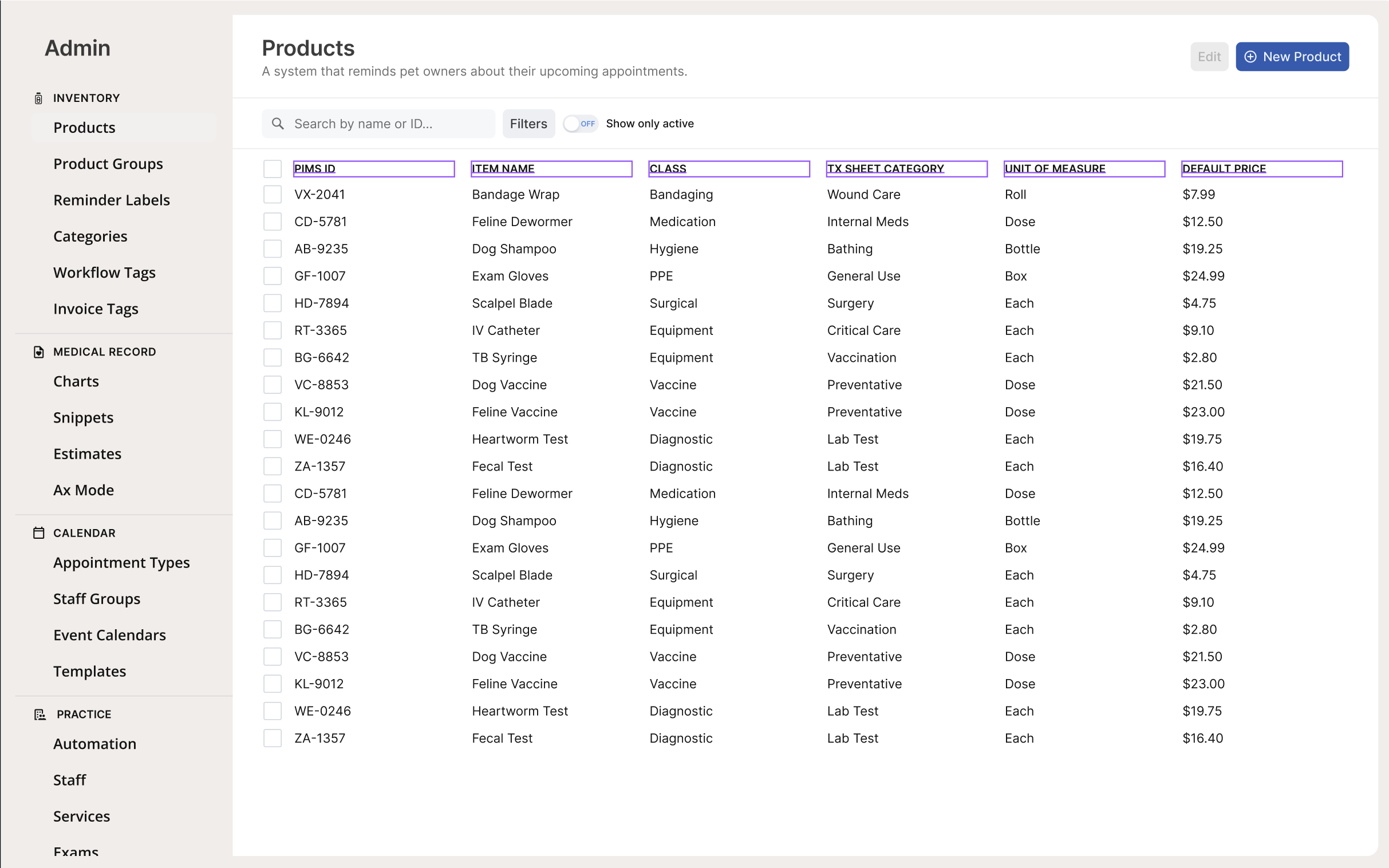
utility-sm fits denser tables with more columns, like the Products admin table where PIMS ID, ITEM NAME, CLASS, TX SHEET CATEGORY, UNIT OF MEASURE, and DEFAULT PRICE all need to coexist at a tighter scale.
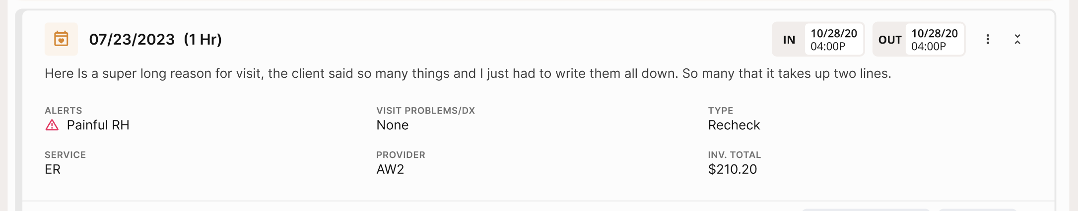
utility-xs is used for sub-labels inside panels, such as the field group headers in an appointment detail card: ALERTS, VISIT PROBLEMS/DX, TYPE, SERVICE, PROVIDER, and INV. TOTAL.
Usage Notes
- The three body sub-groups are the most useful shorthand: clickable means interactive, body text means default, primary identifier means title.
- Use header styles to anchor a view, not to label sections within a dense layout.
- Utility always means all caps. If a label isn't rendered in all caps, it's not a utility style.
- Avoid stacking multiple extra small or small styles in sequence. If a layout pushes you toward
body-xsacross long runs of text, reconsider the layout before reducing type size. - T-shirt size is a judgment call. Match the density and hierarchy of the surrounding context rather than trying to map every instance to an exact size. The goal is a clear, legible hierarchy, not uniformity for its own sake.
Text Styles
All text styles use Inter and are available as CSS custom properties (e.g. var(--font-size-body-md), var(--font-weight-body-md)). Click the copy icon on any token to copy the CSS variable name.
Type Scale (font size, line height, letter spacing)
34 tokens
| Name | Type | Value | Description |
|---|---|---|---|
typography/font/family/Inter | STRING | Inter | — |
typography/font/family/Open/SansDeprecated | STRING | Open Sans | — |
typography/font/family/Ubuntu/Mono | STRING | Ubuntu Mono | — |
typography/font/size/10 | FLOAT | 10px | — |
typography/font/size/12 | FLOAT | 12px | — |
typography/font/size/14 | FLOAT | 14px | — |
typography/font/size/16 | FLOAT | 16px | — |
typography/font/size/20 | FLOAT | 20px | — |
typography/font/size/24 | FLOAT | 24px | — |
typography/font/size/32 | FLOAT | 32px | — |
typography/font/size/40 | FLOAT | 40px | — |
typography/font/size/48 | FLOAT | 48px | — |
typography/font/weight/Bold | STRING | Bold | — |
typography/font/weight/Medium | STRING | Medium | — |
typography/font/weight/Regular | STRING | Regular | — |
typography/font/weight/Semibold | STRING | Semibold | — |
typography/letter/spacing/Normal | FLOAT | 0px | — |
typography/letter/spacing/Tight | FLOAT | -0.5px | — |
typography/letter/spacing/Tighter | FLOAT | -1px | — |
typography/letter/spacing/Wide | FLOAT | 0.5px | — |
typography/letter/spacing/Wider | FLOAT | 1px | — |
typography/line/height/104 | FLOAT | 104px | — |
typography/line/height/12 | FLOAT | 12px | — |
typography/line/height/16 | FLOAT | 16px | — |
typography/line/height/20 | FLOAT | 20px | — |
typography/line/height/24 | FLOAT | 24px | — |
typography/line/height/28 | FLOAT | 28px | — |
typography/line/height/32 | FLOAT | 32px | — |
typography/line/height/36 | FLOAT | 36px | — |
typography/line/height/42 | FLOAT | 42px | — |
typography/line/height/48 | FLOAT | 48px | — |
typography/line/height/52 | FLOAT | 52px | — |
typography/line/height/64 | FLOAT | 64px | — |
typography/line/height/80 | FLOAT | 80px | — |
Font Family
4 tokens
| Name | Type | Value | Description |
|---|---|---|---|
font/font/family/body | STRING | var(--typography-font-family-Inter) | — |
font/font/family/display | STRING | var(--typography-font-family-Inter) | — |
font/font/family/heading | STRING | var(--typography-font-family-Inter) | — |
font/font/family/utility | STRING | var(--typography-font-family-Inter) | — |
Accessibility
Typography size directly affects the contrast ratio required to meet WCAG 2.2 AA (SC 1.4.3). WCAG defines two tiers:
- Large text — regular weight at 24px or above, or bold weight at ~19px or above. Requires a minimum 3:1 contrast ratio.
- Normal text — anything below those thresholds. Requires a minimum 4.5:1 contrast ratio.
The table below maps each Axon text style to its WCAG size classification and minimum required contrast ratio.
| Style | Size | Weight | WCAG classification | Min. contrast (AA) |
|---|---|---|---|---|
header-lg | 40px | 700 | Large | 3:1 |
header-md | 32px | 700 | Large | 3:1 |
header-sm | 24px | 700 | Large | 3:1 |
header-xs | 20px | 700 | Large (bold ≥19px) | 3:1 |
body-lg / body-interactive-lg / body-title-lg | 16px | 400 / 500 / 700 | Normal | 4.5:1 |
body-md / body-interactive-md / body-title-md | 14px | 400 / 500 / 700 | Normal* | 4.5:1 |
body-sm / body-interactive-sm / body-title-sm | 12px | 400 / 500 / 700 | Normal | 4.5:1 |
body-xs / body-interactive-xs / body-title-xs | 10px | 400 / 500 / 700 | Normal | 4.5:1 |
utility-lg | 16px | 700 | Normal | 4.5:1 |
utility-md | 14px | 700 | Normal* | 4.5:1 |
utility-sm | 12px | 700 | Normal | 4.5:1 |
utility-xs | 10px | 700 | Normal | 4.5:1 |
body-title-md and utility-md are 14px bold. WCAG's bold large-text threshold is ~18.66px bold, so 14px bold does not qualify as large text and still requires 4.5:1.
What this means in practice:
- Header styles get the most flexibility. You can use lighter foreground tokens like
-fg-tertiaryon header text more safely, though always verify with a contrast checker. - Extra small and small body styles are the highest risk.
body-xsandbody-smat 10–12px require 4.5:1 and have less room for error. Avoid pairing them with low-opacity foreground tokens like-fg-tertiary(rgba(0,0,0,0.56)) unless the background is confirmed to pass. - Disabled text is exempt. WCAG does not require disabled UI text to meet contrast thresholds, which is why
-fg-disabled(rgba(0,0,0,0.24)) exists as a deliberately low-contrast option. - Utility all-caps text may feel more legible at lower contrast due to letter spacing, but it is not exempt from WCAG requirements. The size-based thresholds still apply.