Button Group
·Updated April 6, 2026
Overview
A button group presents a small set of related actions together. Use it when two or more buttons belong to the same decision and should be perceived as a unit.
Sandbox
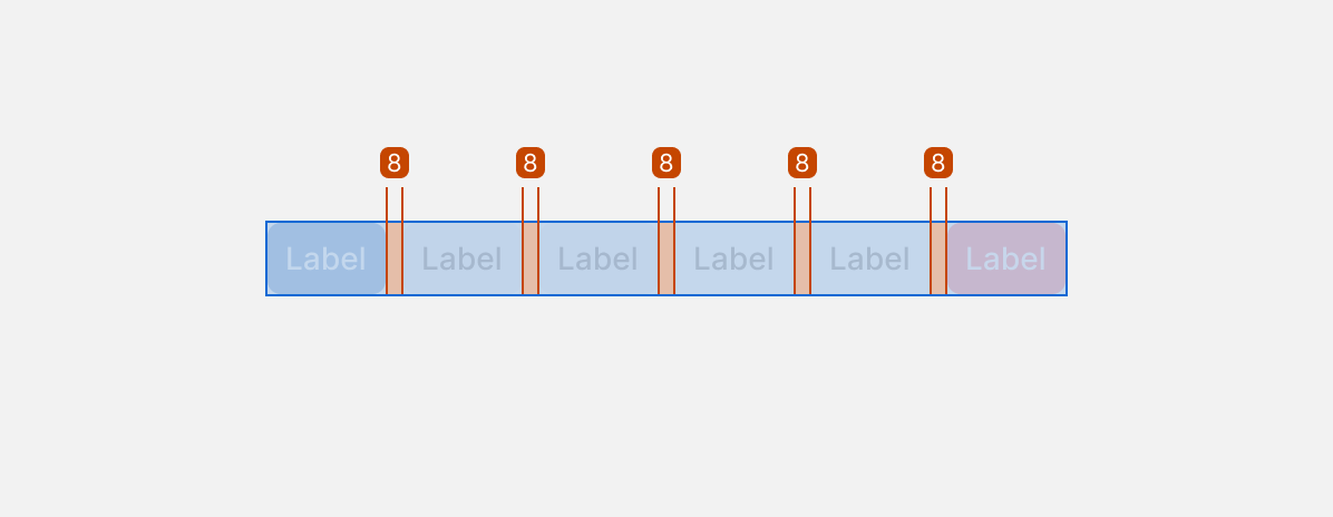
Anatomy
- Container — The wrapper that groups the buttons together.
- Button items — Individual buttons within the group, each following the standard Button component rules.
- Split button trigger (optional) — A secondary target within a button that opens a dropdown of related action variants.
Variants
Button groups are compositions of individual Buttons. Variants are determined by how each button is configured, plus a few group-level rules:
- Count: 2–6 buttons per group (max 6).
- Hierarchy: choose which button variants to use (primary / secondary / tertiary), but keep the set intentional and consistent.
- Icons: optional leading/trailing icons per button (use the same icon size and placement patterns as the Button component).
- Action patterns: if one action has variations (e.g., Save → Save as PDF/PNG), use a split button (primary action + dropdown) or a menu button (menu only).
Usage
Use a button group to surface a small set of related actions without scattering them across the layout.
- Form actions — Save + Cancel is the most common pattern.
- Toolbars and bulk actions — Edit + Export + Delete in a list or table context.
- Split button — Use when there's one clear default action and closely related variations (e.g., Save with a dropdown for Save as PDF or Save as PNG). The alternatives must be true variations of the main action, not unrelated options.
- Menu button — Use when there's no single default action and all options are equal.
Keep groups to 2–6 buttons. All buttons in a group should be the same size and style — don't mix sizes or mix primary with tertiary. If the group can't fit on one line, switch to a stacked layout or overflow pattern.
Best Practices
| Do | Don't |
|---|---|
| Keep actions related and scoped to the same user decision | Don't use a button group to present every available action |
| Use only one primary button per group | Don't include more than one primary in the same group |
| Use a split button when there's a clear default and the alternatives are true variations | Don't use a split button if the arrow trigger is too small to target reliably |
| Order buttons so the most important action is easiest to find | Don't hide frequent actions behind a dropdown when users need them regularly |
Accessibility
- Use semantic buttons: Implement each item as a real
<button>(not a div), so keyboard and assistive tech behavior works by default. - Accessible names: Each button must have a clear text label. If a button is icon-only, provide an accessible name (and a visible tooltip if appropriate).
- Keyboard navigation: All buttons must be reachable with Tab in a logical order and activatable with Enter/Space.
- Visible focus: Provide a clear focus indicator on the focused button. Don’t remove the default focus ring without a strong replacement.
- Don’t rely on color alone: Ensure hover/focus/disabled states are distinguishable beyond color (shape, outline, opacity, icon).
- Touch target size: Ensure each button (including split-button arrows) meets minimum touch target size and has enough spacing to avoid mis-taps.
- Split buttons:
- The main action and the menu trigger must be separate focusable controls.
- The menu trigger must have an accessible name (e.g., “More save options”) and convey expanded/collapsed state.
- Menu behavior (when used):
- Opening the menu moves focus into it; closing returns focus to the trigger.
- Menu items are keyboard navigable and selectable; Escape closes the menu.
- Disabled buttons: Use the disabled state for truly unavailable actions; keep disabled labels readable and do not hide critical actions without explanation.
- Announce changes: If an action triggers an inline update (not a full page change), ensure the update is perceivable (status text, toast, or other announcement pattern).