Text Fields
Overview
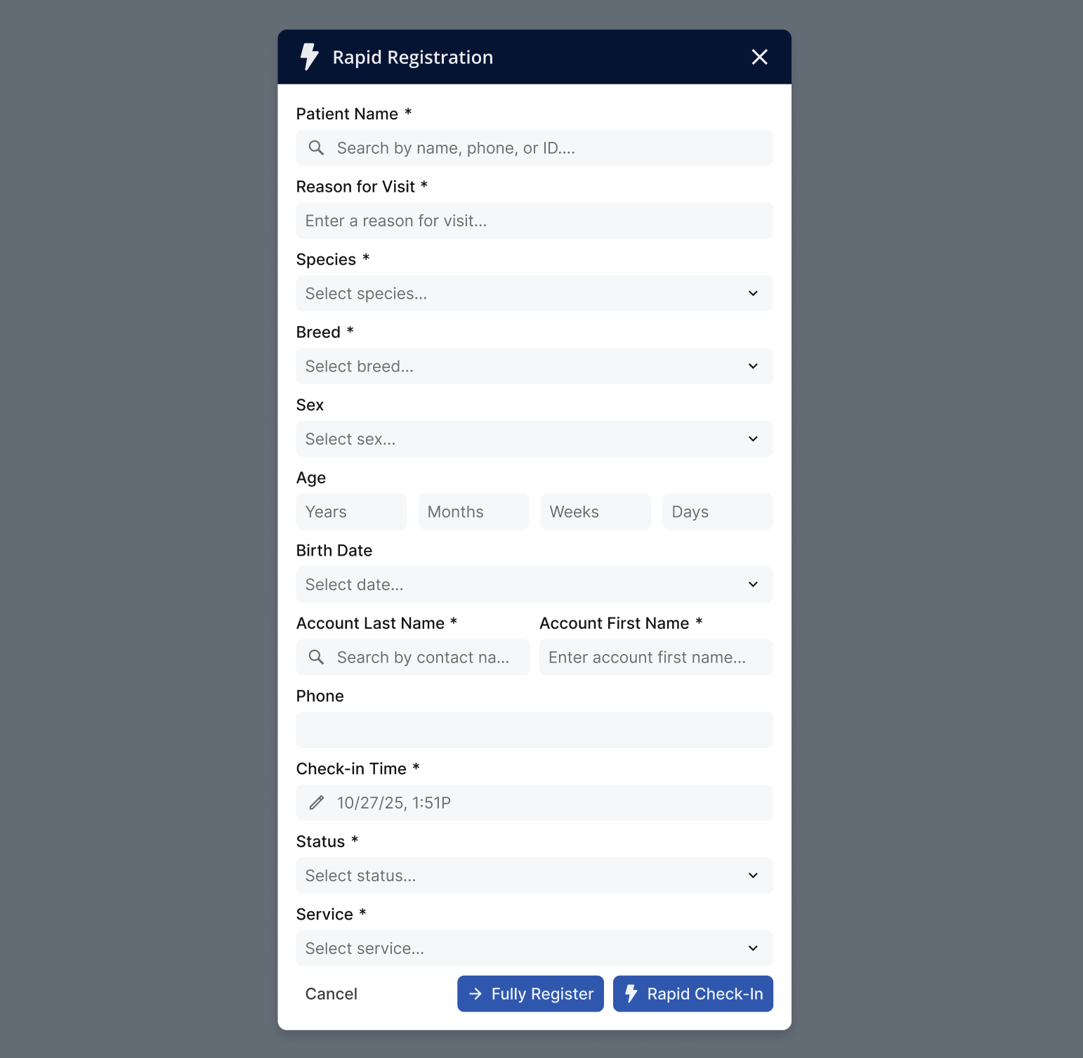
Text fields let users enter, edit, or review a single line of text. Use one when the value is freeform or follows a known format that still requires typing.
Sandbox
Anatomy
- Container — The input surface, including the border that reflects the current state.
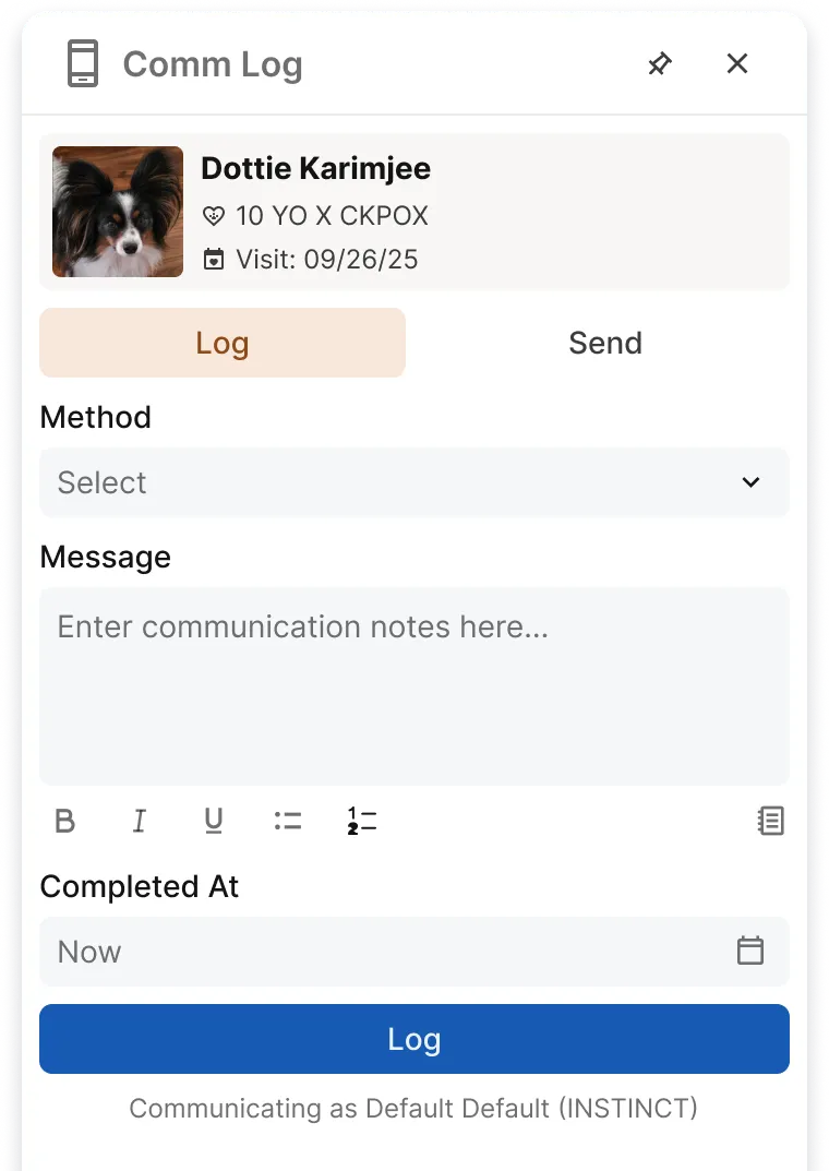
- Label — A persistent text label above the field describing what it collects.
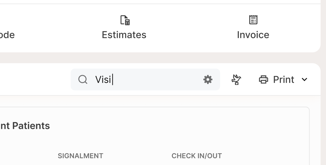
- Input text — The value the user types or the placeholder when empty.
- Leading icon (optional) — An icon before the input text, used for search or contextual affordance.
- Trailing icon (optional) — An icon after the input text, used for actions like clearing or toggling visibility.
- Helper text (optional) — Supplemental guidance below the field, such as format hints or character limits.
- Error text — Replaces helper text when validation fails; describes what went wrong and how to fix it.
Usage
Use a text field when the value is freeform or follows a known format that still requires typing.
- Short text entry (e.g., pet name, clinic name)
- Formatted values (e.g., email, phone, ID or reference numbers)
- Search and quick filtering (e.g., Search patients)
- Numeric entry when typing is faster than a picker (e.g., weight, quantity)
Size the field to match the expected content length. Short fields (age, CVV) should be narrow. Long fields (email, full name) should fill more of the container. Use one size per form — don’t mix Sm, Md, and Lg on the same surface. Use Sm in dense UIs like tables and filters, Md for standard forms, and Lg for touch-first or high-visibility contexts.
Always include a visible label. Use helper text for format hints or constraints. Reserve placeholder text for supplemental hints only — never as a substitute for the label.
Best Practices
| Do | Don't |
|---|---|
| Use a clear, persistent label above the field | Don't use placeholder text as the only label — it disappears and is inaccessible |
| Use helper text for format hints and constraints (e.g., MM/DD/YYYY, 10 characters max) | Don't put long instructions in the label; use helper text instead |
| Show errors after interaction (on blur or submit), not on the first keystroke | Don't rely on color alone to communicate an error; always include an error message |
| Use leading/trailing icons only when they add meaning (search, visibility toggle) | Don't disable fields unless users truly can't interact — use read-only instead |
| Match the input type to the data: email, number, password as appropriate | Don't accept invalid formats silently; explain what's required |
Accessibility
- Ensure every input has a programmatic label that matches the visible label.
- Keep label + input adjacent and in a logical reading order (label → field → helper/error).
- Associate helper text and error text with the input so assistive tech reads it.
- Provide a visible focus indicator that’s clear in all sizes and states.
- Don’t rely on placeholder text for meaning; it may not be announced consistently and is lower-visibility.
- Use appropriate HTML attributes when available:
- type (email, number, password), autocomplete, inputmode
- required / aria-required when applicable
- min, max, maxlength, and clear instructions when limits exist
- When showing validation errors:
- Clearly describe the issue and how to fix it
- Ensure errors are announced when they appear
- If icons are interactive (e.g., “show password”), they must be keyboard focusable, have an accessible name, and meet minimum target size.