Radio Buttons
·Updated April 6, 2026
Overview
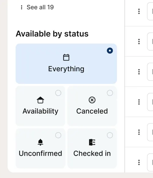
Radio buttons let users select exactly one option from a set of two or more. Use them when the choices are mutually exclusive and should all be visible at once so users can compare before committing.
Sandbox
Anatomy
- Button — The circular control that displays selected or unselected state.
- Selection indicator — A filled dot visible when the option is selected.
- Label (optional) — Text describing the option. Provided via Input Control Group.
Usage
Radio buttons are for single-choice selections where all options should be visible at once. Use them when the choice is mutually exclusive and the user benefits from comparing options before committing.
- Choosing one setting from a short set (e.g., Email, Text, Phone)
- Selecting a single category or mode (e.g., Small, Medium, Large)
- Picking one workflow path (e.g., New customer vs. Existing customer)
Keep groups to 2–8 options. If you need more, use a dropdown or searchable select instead.
When not to use: Don't use radio buttons when multiple selections are allowed. Use checkboxes instead.
Best Practices
| Do | Don't |
|---|---|
| Use radio buttons for single-choice selections only | Don't use radio buttons when multiple selections are allowed — use checkboxes |
| Keep groups to 2–8 options | Don't use radio buttons for long lists; use a dropdown or searchable select |
| Write labels that are clear, parallel, and specific | Don't mix independent choices in a single radio group |
| Select a sensible default when most users will pick the same option | Don't rely on selected state alone to communicate meaning; the label must do the work |
| Make the entire row clickable: control and label | Don't disable an option without a way for users to understand why |
Accessibility
- Provide a group label: Every radio group should have a clear, descriptive label that explains what the user is choosing (e.g., “Preferred contact method”).
- Use a single group container: Implement radios within a semantic group (e.g., fieldset + legend, or an element with role="radiogroup" + an accessible name).
- Ensure labels are programmatically associated: Each radio must have an explicit label relationship (e.g., label + for, or aria-labelledby). Don’t rely on placeholder text or position.
- Make the whole row clickable: The tap/click target should include both the control and its label to support touch users and reduce precision needs.
- Keyboard support (required):
- Tab moves focus into and out of the radio group.
- Arrow keys move focus and selection between options (Up/Left = previous, Down/Right = next).
- Space/Enter selects the focused option (depending on platform conventions).
- Focus visibility: Show a clear, high-contrast focus indicator on the focused radio (or the selected/focused row) and don’t remove the browser focus ring without a strong replacement.
- Selection is mutually exclusive: Selecting one option must automatically unselect the previous option within the same group.
- State is conveyed beyond color: Selected, focused, disabled, and error states must be communicated with more than color alone (shape, icon, text, or outline).
- Disabled radios remain perceivable: Disabled options should still be readable; avoid overly low contrast for labels.
- Announce help and errors: If the group has helper text or an error message, ensure it’s associated with the group so assistive tech reads it (e.g., aria-describedby).
- Error placement is group-level: Treat validation and messaging as belonging to the group (not each individual option), unless only one option is invalid for a specific reason.
- Keep labels meaningful: Labels should be concise and unambiguous when read aloud out of context (avoid “Option 1 / Option 2”).
- Meet contrast requirements: Text and interactive elements (including focus indicators) should meet WCAG contrast guidance for readability and discoverability.