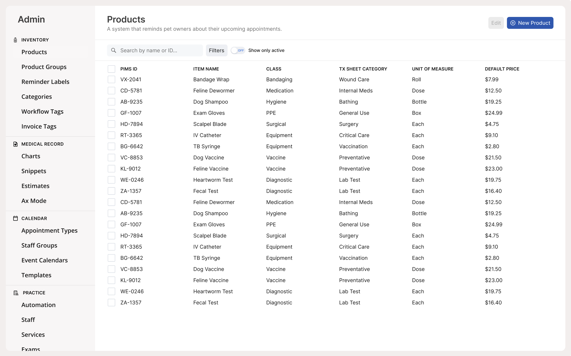
Checkboxes
·Updated April 6, 2026
Overview
A checkbox lets users select one or more items from a set. It represents a binary choice — checked or unchecked — and can be used on its own or as part of a group. When a label is needed, use the Input Control Group component to wrap it.
Sandbox
Anatomy
- Box — The square control that displays the checked, unchecked, or indeterminate state.
- Checkmark icon — Visible when checked; hidden when unchecked.
- Indeterminate icon — A dash shown when only some items in a group are selected.
- Label (optional) — Text describing the option. Provided via Input Control Group.
Usage
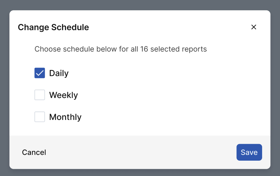
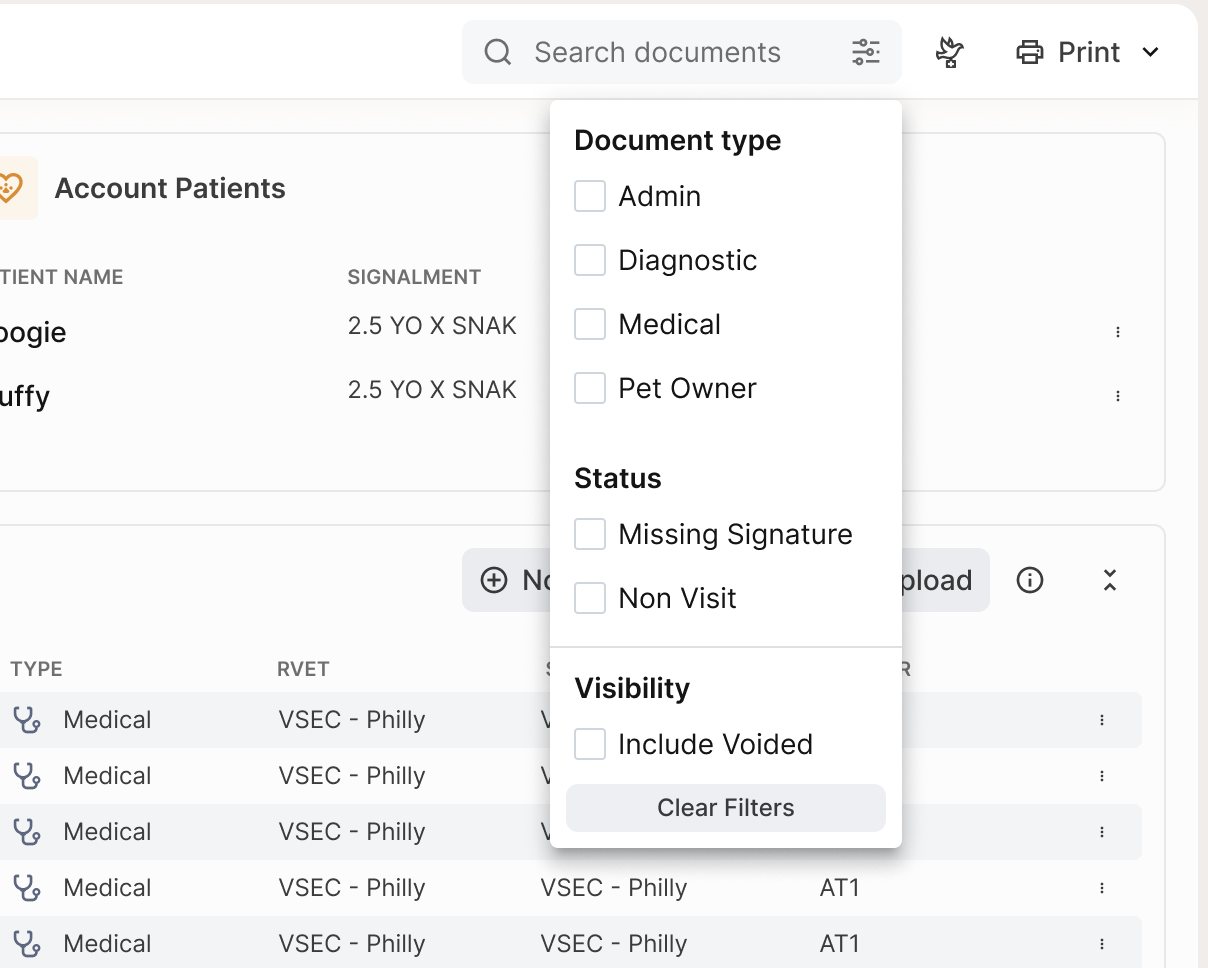
Use checkboxes when users can select any number of options from a set, including none. Each checkbox is independent. They also work as a standalone yes/no control for acknowledgements or single preferences.
- Multi-select preferences (e.g., notification channels)
- Filters (e.g., Dogs, Cats, Available today)
- Selecting multiple items in a list for bulk actions
- Single opt-in or acknowledgement (e.g., Send me updates, I agree to the terms)
Checkbox groups can include Select all and Select none controls to reduce effort on long lists. These should affect only the options within that group.
When not to use: Don't use checkboxes for mutually exclusive choices. Use radio buttons instead.
Best Practices
| Do | Don't |
|---|---|
| Write labels so both checked and unchecked states make sense | Don't use negative labels that create mental inversion (e.g., "Don't send...") |
| Use positive phrasing; keep labels short, parallel, and easy to scan | Don't use checkboxes for mutually exclusive choices — use radio buttons |
| Make the entire row clickable: checkbox, label, and any description | Don't rely on visuals alone; add helper text when constraints exist (e.g., "Choose up to 3") |
| Stack options vertically; use horizontal only for short, simple sets | Don't add Select all to very short lists where it adds clutter without saving effort |
| Include Select all / Select none for long lists or common bulk actions | Don't make bulk controls ambiguous — they should affect only that group |
Accessibility
- Use native inputs when possible: Prefer a real checkbox control so keyboard and assistive-technology behavior works by default.
- Always provide an accessible name: Every checkbox must have a programmatic label (the visible text label should be associated to the control).
- Make the whole row clickable/tappable: The checkbox and its label (and optional description) should be one hit target.
- Support keyboard interaction:
- Tab moves focus to each checkbox.
- Space toggles checked/unchecked.
- Use a clear focus indicator: Focus should be obvious on all backgrounds and in all states.
- Don’t rely on color alone: Checked/unchecked/indeterminate/disabled/error states must be distinguishable via shape/icon/text in addition to color.
- Meet contrast requirements: Ensure label text, focus indicators, and checkbox marks/borders are legible; disabled should still be readable.
- Group related checkboxes: If multiple checkboxes answer one question, provide a group label and keep the group’s help/error text tied to that group.
- Associate help and error text: If helper text or validation errors exist, ensure assistive tech reads them with the checkbox or group.
- Use indeterminate state correctly: Only use “mixed” to represent partial selection in a parent/child list (e.g., some items selected). It should not be a third user-chosen option.
- Announce state changes: When toggling reveals/hides content, update content predictably and ensure it’s discoverable (don’t “teleport” focus unexpectedly).
- Respect touch target size: Make the interactive area large enough for touch users, not just the small square.