Pane
Overview
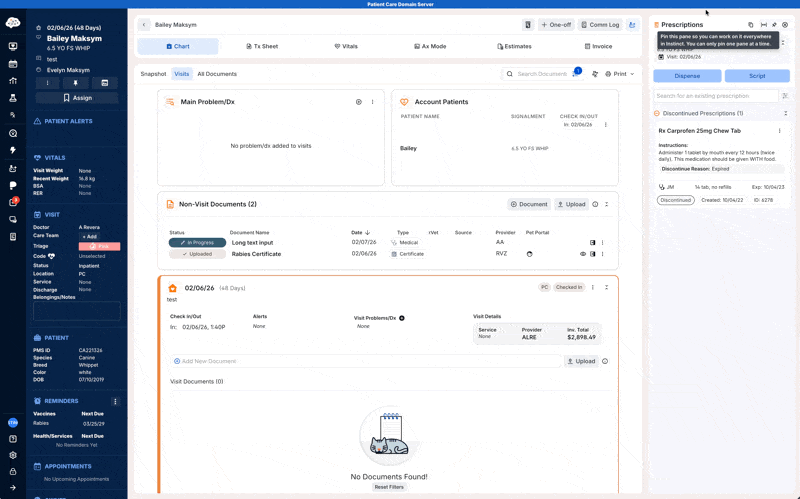
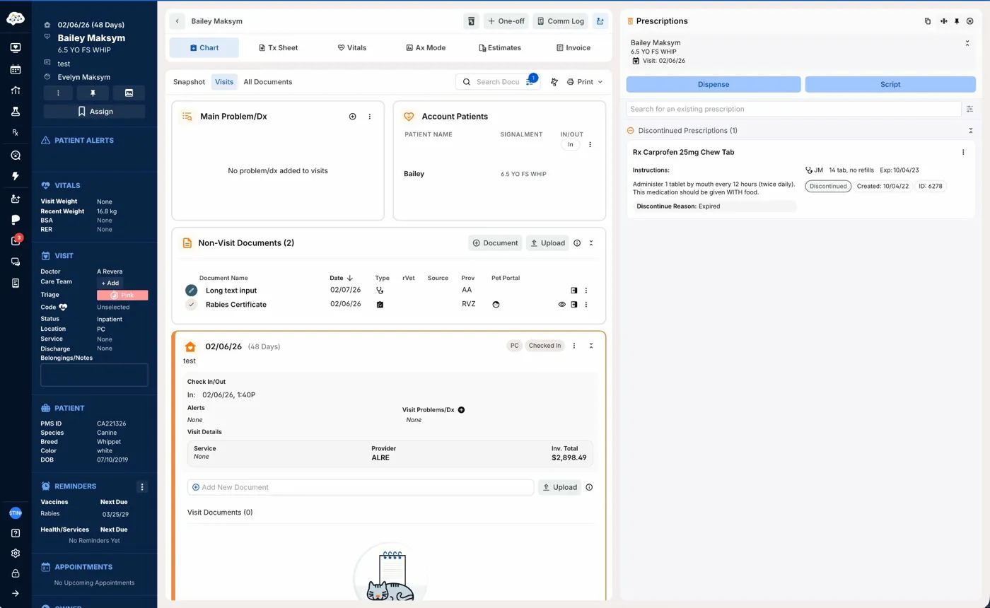
A pane is a panel that slides in from the right side of the viewport and compresses the main content area. Panes support side-by-side workflows where a user needs access to a tool or a detailed view without leaving their current screen context.
Sandbox
Anatomy
- Container — The panel surface, fixed to the right edge of the viewport, that holds all pane content.
- Header — The top bar containing the title, leading icon, and action controls.
- Leading icon — A contextual icon to the left of the pane title identifying the tool or content type.
- Title — The name of the pane, using
body-title-lg. - Header actions — Icon buttons in the top-right corner for pin, expand/collapse, and close.
- Content area — The scrollable body of the pane, rendered differently per context.
Variants
Width
Standard (360px) The default width. Used for all five primary tool panes and most detail panes.
Expanded (720px) A wider variant for content that benefits from more horizontal space. All panes support toggling between standard and expanded via the header action. Only one pane can be expanded at a time. If a second pane is open when one expands, the second pane automatically closes.
Pinned vs. unpinned
Unpinned (default) The pane closes when the user navigates away from the current screen.
Pinned The pane persists across navigation. The pin action in the header reflects the current state. Only one pane can be pinned at a time.
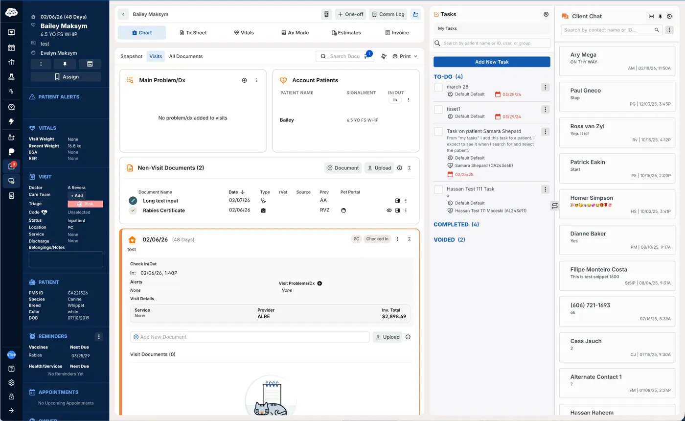
Single vs. dual pane
Up to two panes can be open simultaneously, stacking horizontally from the right. Each maintains its own width and the main content area compresses to accommodate both. Expanding one pane while two are open closes the other automatically.
Usage
Panes are for workflows where the user needs persistent access to a tool or contextual detail without leaving the current screen.
Tool panes are launched from the third group in the primary navigation. The five tools are:
- Assistant — AI chatbot for in-workflow support
- Plumbs & Standards — Drug search and monograph reference (availability depends on plan)
- Tasks — Task list management
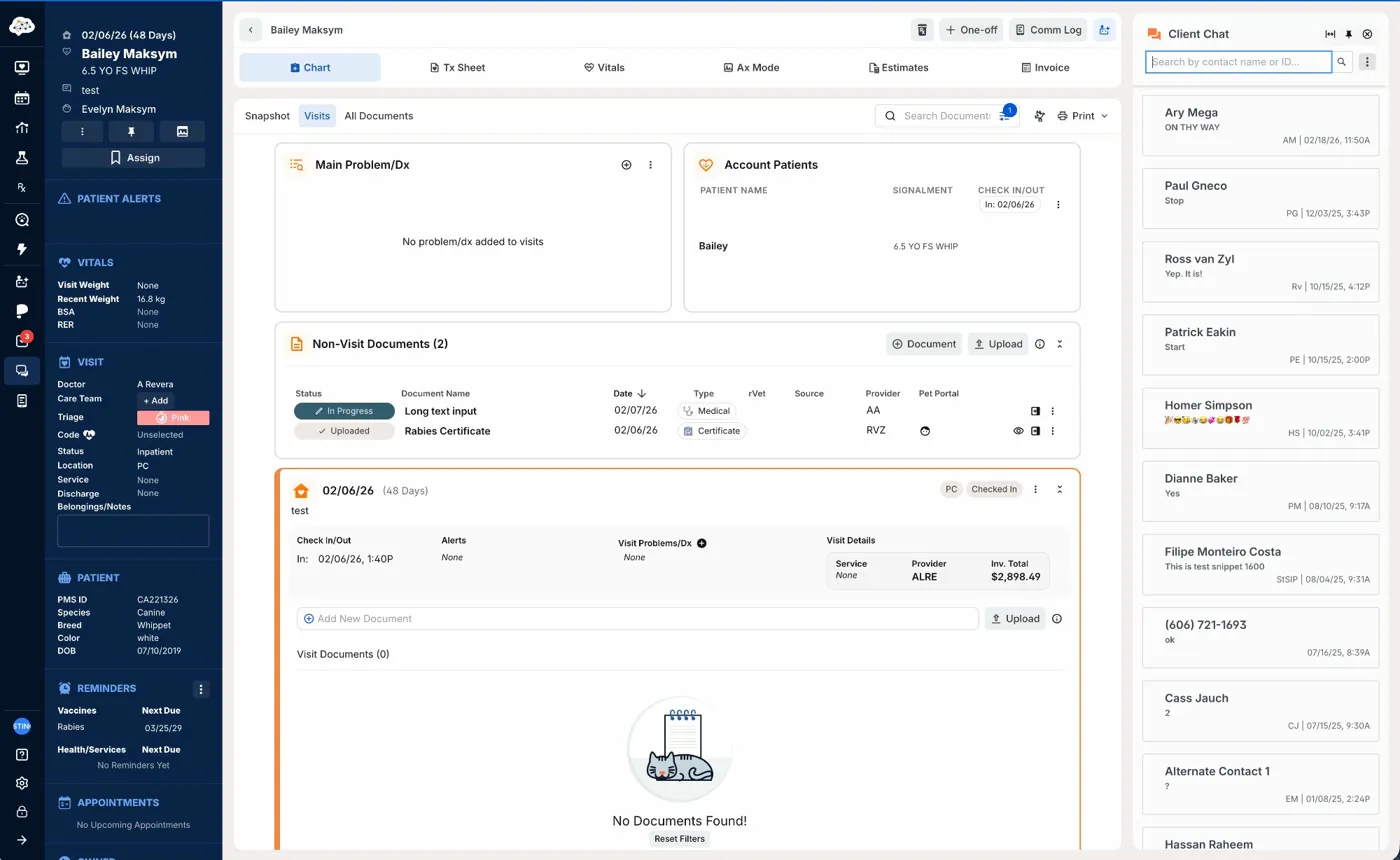
- Client Chat — Direct messaging with the client
- Comm Log — Communication logging and outbound messaging for a patient
Detail panes are launched from inline controls within a screen. Known contexts include:
- Prescriptions — Triggered from the Rx icon on a patient chart; shows all prescriptions for that patient
- Document preview — Triggered by clicking a document in the chart
- Appointment / event creation — Triggered from the calendar screen when creating a new appointment or event
- Payments — Triggered from the financials page when viewing payment details
The main content area compresses as panes open. At very narrow viewport widths the body collapses entirely while panes maintain their width. Instinct does not support sub-1024px breakpoints.
When not to use a pane: If the task requires full focus and no side-by-side context is needed, use a modal or navigate to a dedicated screen instead.
Best Practices
| Do | Don't |
|---|---|
| Always include a leading icon in the pane header matching the tool or content type | Don't show a title-only header without an icon |
| Include pin, expand/collapse, and close in every pane header | Don't omit or vary the standard header actions across panes |
| Keep the pane title to the tool or content name only | Don't include patient or account context in the title when it's already visible on screen |
| Allow the main content area to compress as panes open | Don't overlay or cover the main content with a pane |
| Preserve pinned pane state across navigation | Don't reset a pinned pane when the user changes screens |
| Close the second pane automatically when the user expands one | Don't allow two expanded panes to coexist |
Accessibility
- The pane container should use
role="complementary"orrole="region"with anaria-labelmatching the pane title. - Focus should move into the pane when it opens. When the pane closes, focus returns to the element that triggered it.
- The close, pin, and expand/collapse buttons must each have an
aria-labeldescribing the action. - The expand/collapse button must reflect current state via
aria-expanded="true"oraria-expanded="false". - The pin button should use
aria-pressedto communicate pinned vs. unpinned state to screen readers. - Tab order within the pane should follow visual reading order: header actions first, then content.