Toggle Button Group
Overview
A toggle button group lets users switch between mutually exclusive views or modes. Selecting one option deselects the others. It always renders as a horizontal row of buttons inside a single bordered container.
Sandbox
Anatomy
- Container — The bordered wrapper that groups all buttons together
- Button — An individual selectable option within the group
- Icon (optional) — A 20px icon representing the option, used in icon-only variants
- Label (optional) — Short text describing the option, used in label-only variants
- Active indicator — The light blue background fill applied to the selected button
Specs
Sizing
| Property | Token | Value |
|---|---|---|
| Container height | --layout-height-standard-md | 32px |
| Button height | --size-md | 24px |
| Icon size | --icon-size-sm | 20px |
Spacing
| Property | Token | Value |
|---|---|---|
| Container padding (x, y) | --padding-sm | 4px |
| Button padding (x) | --padding-lg | 8px |
Border
| Property | Token | Value |
|---|---|---|
| Container border width | --border-size-sm | 1px |
| Container border color | --border-interactive-primary-enabled | rgba(0,0,0,0.12) |
| Container border radius | --border-radius-default | 6px |
Typography (label variant)
| Property | Style | Value |
|---|---|---|
| Label | body-interactive-sm | 12px / 500 |
Usage
Toggle button groups appear in a handful of specific places in Instinct. Use them when users need to switch between mutually exclusive views or modes.
-
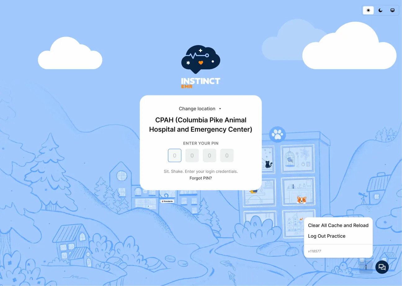
Theme switcher on the login screen — An icon-only group lets users select light mode, dark mode, or system default before signing in.
-
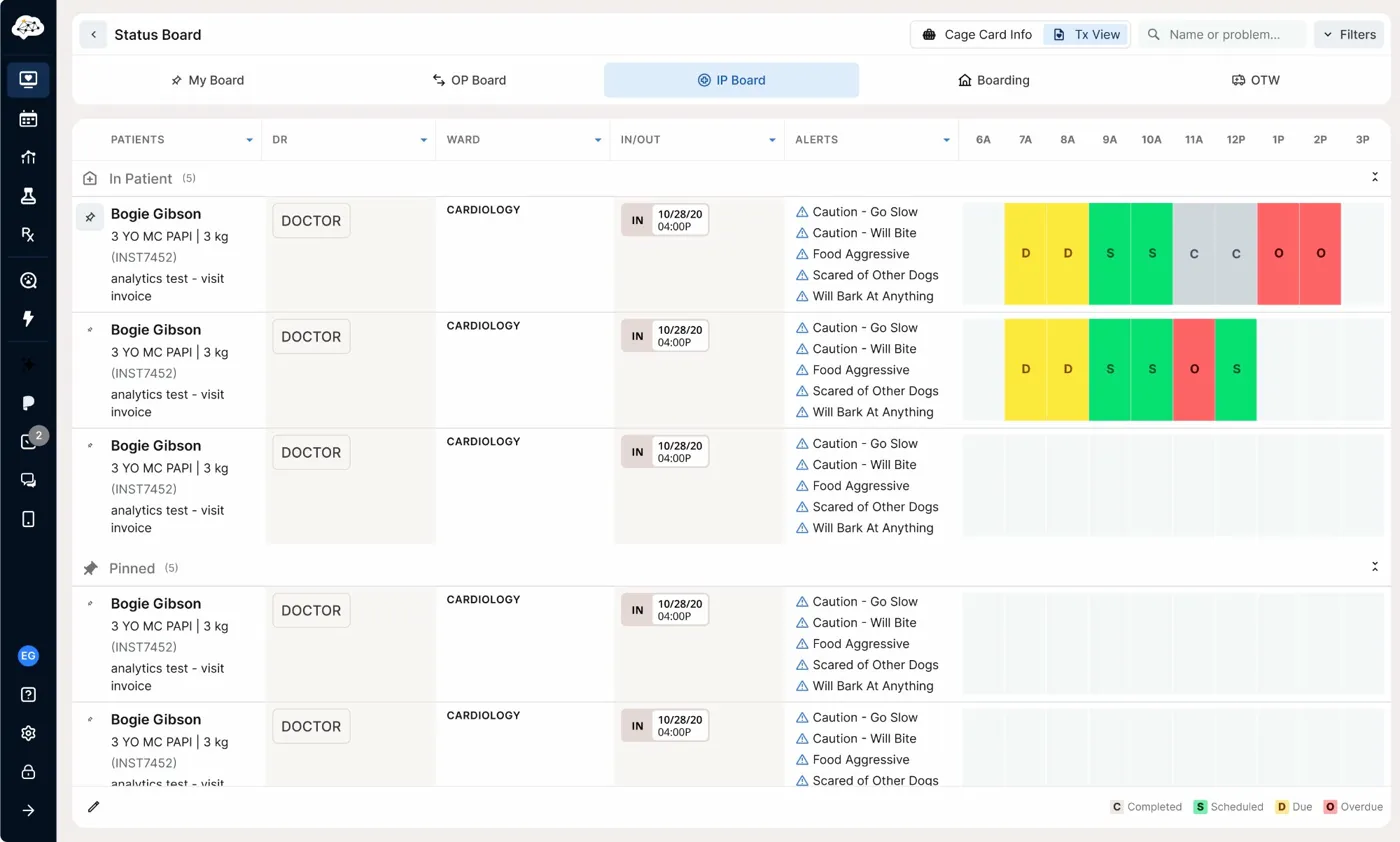
Status board header — A label-only group ("Cage Card Info" / "Tx View") controls which data view is shown for patients on the IP Board.
-
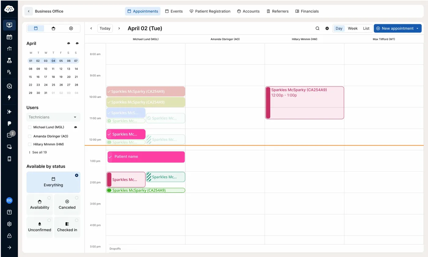
Calendar view picker (deprecated) — Previously used to switch between Day, Week, and List views on the Business Office calendar. Included here as a reference for the icon-only pattern.
Don't use a toggle button group when more than one option can be active at once. Use checkboxes or a tag group instead.
Best Practices
| Do | Don't |
|---|---|
| Use short labels, one to two words max | Don't use full phrases or sentences as button labels |
| Keep all buttons in a group the same width where possible | Don't mix icon-only and label-only buttons in the same group |
| Limit groups to two to four options | Don't use for more than four options — reach for tabs instead |
| Use icon-only when icons are unambiguous and space is tight | Don't use icons that require a tooltip to be understood |
Accessibility
- The container should use
role="group"with anaria-labeldescribing the purpose (e.g.,aria-label="View mode"). - Each button should carry
aria-pressed="true"oraria-pressed="false"to communicate selection state to screen readers. - Tab moves focus through the group. Space or Enter activates the focused button.
- Icon-only buttons require an
aria-labelon each button. Do not rely on the icon alone to convey meaning. - The active state is communicated through both background fill and foreground color. Confirm that
-fg-input-controls-primary-selectedmeets WCAG 2.1 AA contrast against-bg-input-controls-primary-selected. - Disabled buttons should include
aria-disabled="true"and should not receive focus.