Tabs
Overview
Tabs let users switch between distinct views within the same context. In Axon, tabs are built from button components rather than a custom tab primitive, which keeps interaction patterns consistent across the system.
Sandbox
Anatomy
Primary tab group
- Container — A horizontal row of buttons, flush to the top of the content area.
- Active tab — A medium flat button in the selected state; indicates the current view.
- Inactive tab — A medium secondary button; indicates available but unselected views.
- Leading icon (optional) — Icon placed before the label; used in primary tab groups.
Secondary tab group
- Container — A horizontal row of buttons below the primary tab group.
- Active tab — A medium flat button in the selected state.
- Inactive tab — A medium flat button in the default (unselected) state; no icon.
Variants
Primary tab group
Used at the top level of a patient context. Each tab is a medium secondary button (inactive) or medium flat selected (active). Tabs include a leading icon alongside the label.
Secondary tab group
Used one level below the primary group, such as within the patient chart. Tabs are medium flat (inactive) or medium flat selected (active). No icons are used in this group.
States
Both tab types share standard button states: default, hover, focus, active, and disabled. The selected state is persistent and indicates the currently active view. Disabled tabs reduce opacity and remove pointer interaction.
Usage
Tabs appear at the top of a page or panel to switch between distinct views within the same context. The selected tab always reflects the currently visible content.
-
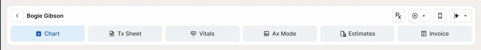
Patient header (primary tabs) — Chart, Tx Sheet, Vitals, Ax Mode, Estimates, and Invoice are primary tabs. Each navigates to a distinct workspace within the patient visit.
-
Patient chart (secondary tabs) — Visits, All Documents, and Profile appear as secondary tabs beneath the patient header. No icons are used here.

-
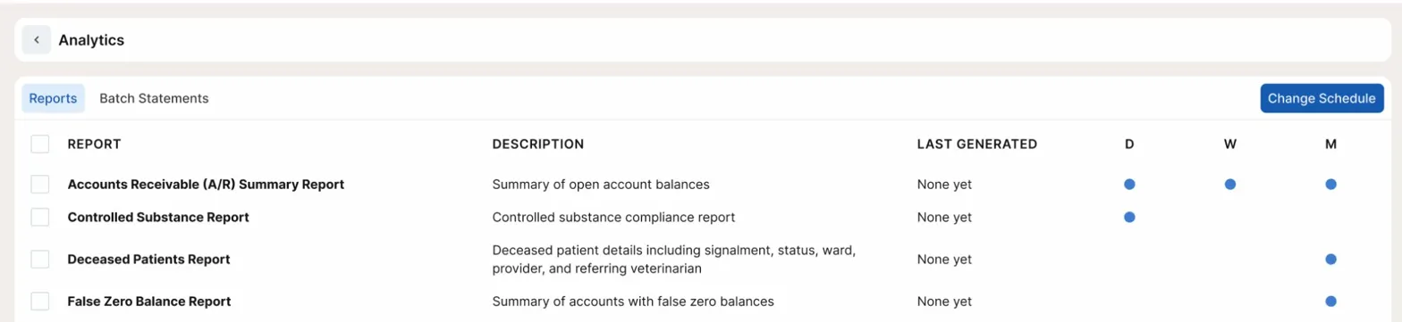
Analytics (secondary tabs) — Reports and Batch Statements use the same secondary tab pattern to switch between report types.
Don't use tabs for toggle button groups. If the controls are visually grouped inside a shared border container (like the calendar view switcher), use the Toggle Button Group component instead. See Toggle Button for details.
Best Practices
| Do | Don't |
|---|---|
| Use primary tabs with icons at the top level of a patient context | Don't add icons to secondary-level tabs |
| Keep tab labels short, one or two words | Don't use tabs to navigate between unrelated pages or flows |
| Use secondary tabs for sub-navigation within a page that already has primary tabs | Don't nest more than two levels of tabs |
| Use Toggle Button Group when tabs need a shared container border | Don't use a custom tab component when the button-based pattern fits |
Accessibility
- Tabs must use
role="tablist"on the container,role="tab"on each tab button, androle="tabpanel"on the corresponding content area. - The active tab must have
aria-selected="true". Inactive tabs must havearia-selected="false". - Each tab must have an accessible label. If the tab relies solely on an icon, include an
aria-labelon the button. - Keyboard navigation: Tab moves focus into the tab group. Arrow keys (Left/Right) move between tabs. Enter or Space activates the focused tab.
- The visible focus indicator must meet WCAG 2.1 AA contrast requirements against the surrounding surface.
- Tab content panels must be associated with their trigger using
aria-controlson the tab andaria-labelledbyon the panel.